Controversy over the jubilee logo: A gift to the Government from the Government
Prepared by: Itana Kaluđerović
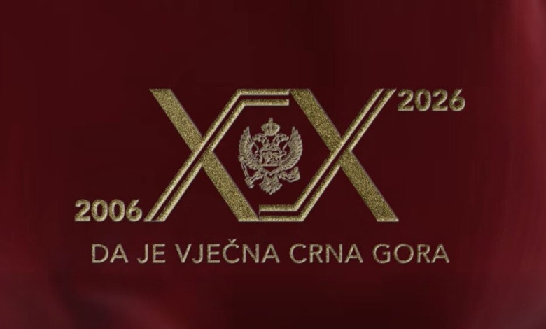
The competition for the visual identity marking the 20th anniversary of the restoration of independence was announced twice late last year. It is known that seven candidates applied to the first competition - their identities remain unknown. Information about the second competition is even more obscure. The public only knows that it was annulled, but not how many candidates applied. The Government’s explanation was that none of the proposed solutions met the criteria. To make matters even more unusual, the final selected logo was one submitted to the Government as a gift - by a collaborator engaged within the Government itself.
Failure to meet criteria
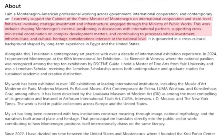
Two competitions - both annulled. Proposed ideas - insufficiently good. As a result, the Government selected, as the official visual identity for the celebration of 20 years since the restoration of Montenegro’s independence, a donation by Darja Bajagić. Publicly available data on LinkedIn shows that Bajagić is engaged as an associate for international cooperation within the Ministry of Public Works, headed by Majda Adžović, as well as within the Office of Prime Minister Milojko Spajić. Her biography on the platform states that she participates in processes involving strategic investments, international cooperation, and coordination between institutions, including initiatives that connect infrastructure and cultural heritage.
The information that a donated solution was selected as the visual identity for the jubilee, as well as the graphic design itself, triggered reactions from the public, critics, and professionals alike. They claim that the logo fails to meet any of the four criteria that such a form should satisfy.
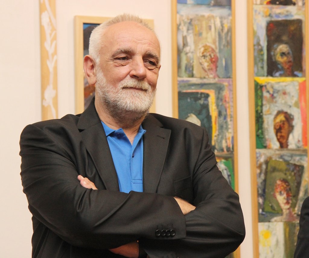
- In that sense, one can consider: the logo as a sign, the logo as a symbol with meaning, as an aesthetic image with its own visual qualities, and the logo as a practical object that ultimately needs to appear on a screen, paper, wood, etc. What we are seeing now, what I have seen through the media regarding the form and content of the jubilee logo, fails on all four of these criteria - said Professor Nikola Latković from the Faculty of Visual Arts in Podgorica/MFA for Television E.
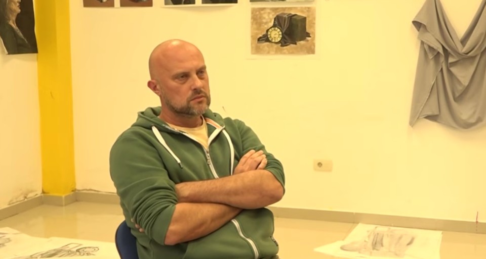
Dejan Batrićević, a graphic designer, agrees.
- To be basically and professionally precise: what is being presented to us as a solution is not a sign at all. By its nature, a sign must be reduced, symbolically strong, and technically functional. What we have here is an aggressive graphic mishmash, a kind of overcrowded illustration that resembles more the emblem of a provincial hockey club or tangled barbed wire than a symbol of state dignity. The craft illiteracy of this solution is best reflected in the complete absence of aesthetic sensibility - Batrićević told Portal Analitika.
Unqualified Committee
Following the presentation of the Government’s chosen jubilee logo, candidates whose works were not accepted also reacted, presenting their design proposals to the public. However, another reason for the professional backlash is the questionable expertise of the committee that evaluated the submissions. It consisted of the director of the Music Center Vučić Ćetković, the director of the Film Center Aleksandra Božović, and Prime Minister’s advisor Veliša Jovanović.

- The fact that there were no designers on the Committee is not surprising but rather a logical continuation of what we have been seeing for years. It has become normal here for everyone to think they know how to design… Then a classic absurdity occurs: those same people, who until yesterday looked down on us, suddenly start „assembling“ logos and acting as authorities in a field they know nothing about. Excluding professionals from decision-making directly undermines the integrity of any such process - said Batrićević.
According to Nikola Latković, this is not unique to Montenegro, but it is becoming increasingly common.
- There is a well-known case from Russia in 2018 when a logo was being designed for the most important secondary thing in the world. That logo was decided upon by football managers, a goalkeeper, a pianist, a conductor, and an actress. I am afraid that in this case we have something similar, where graphic design is being decided by design dilettantes, that is, graphic laypeople - he assessed.
A heraldic symbol of disappearance
Academic painter Rajko Todorović Todor points to the political meaning of the selected logo.
- For the 20th anniversary of the restoration of independence, we got a symbol for free - that’s what the Government says, in a crude and manipulative way. And let me say right away: this is not a symbol of the restoration of Montenegrin independence - these are „four sticks“, „Žika’s Kaleidoscope“, „badges from a šajkača“… Truly, this is not a jubilee symbol, it is a symbol of this government – „liberators“ who seem to have liberated themselves only to betray the homeland. What they do not see or understand are the emphasized diagonals - a heraldic symbol of disappearance. So let them disappear, the sooner, the better - said Todorović.
Television E sent questions to the Government regarding when the second competition was annulled, how many candidates applied, and whether the same committee served for both competitions. No responses have been received so far.